How to build a sitemap – A simple guide
How to build a sitemap. – A simple Guide
It’s a little more complex than that though. In this post I want to write my second ‘themed’ topic of conversation about all the things you’ll need to consider around how to build a sitemap. The post is designed to give you a very over-arching ‘flavour’ of all the disciplines needed when building a site, and whilst is not intended to give you an exhaustive guide on building your website & ever tenet of it, you should be able to get a gyst’. I’m currently trying to give my client a gyst, so hopefully this will help.
It’s actually called Information Architecture (IA)
Not to be confused with User Experience (or UX), IA is holistically described (be me) as ‘the process of getting the right information to the right people at the right time in a way which makes sense’.
If you think about websites, we’ve all been at the mercy of a terrible User Interface (or UI) which gives us subsequently a terrible User Experience (UX) and we leave the site to go to a competitor. How many times have you not been able to find contact details on a website? Or a price for a product?
Trends, expectations & the nature of the content also drive the way a website presents information. SnapChat is a classic example of a hideously complex user interface whereas companies like Apple have perfected the UX and UI, presenting information in such a way which feels organic, natural and easy to use without you ever getting stuck & wondering where to find something.
And that’s the key word – ‘feel’. Good websites make you feel like you’re interacting with a ‘thing’ – something more than a website. Companies who actively make UX and UI complicated to purposely misguide the user, well yeah, you can do that too – think the last time you tried to unsubscribe from a marketing email but you unsubscribe by leaving the tick ‘in’ but the words state the opposite – this is bullshit and you shouldn’t do this.
Building your map.
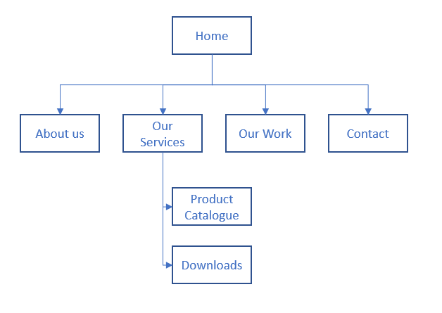
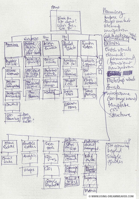
Often called JSD or ‘Jackson Structed Design’ in Academia, you can break out Microsoft Visio or some post it notes and map out how you want the back bone of your site to look. Something like this;

Although very simple, the above shows a sitemap. The good idea around post-it notes is you can move things around and brainstorm ideas about how every aspect of the site should look. Its only when you have this backbone can you start to think about how to wrap a creative layer around it and how to not only present it to the user, but what content you’re going to need to create in the first place.

Be careful of going too high fidelity too soon, so don’t start doing your sitemap in prototyping software like Axure, you’ll immediately get lost in the design & implementation and not focus on just delivering what your customer needs to know.

Case study
So let’s look at my example, I’m building a website which let’s say sell’s lightbulbs. I ask myself ‘what are the things someone looking at this site is going to want’
- Finding the right lightbulb
- Finding information out about the lightbulb
- Browsing what lightbulbs are in stock
- How to return a purchased bulb
- Contact information
You could argue at a very simple level, the above is all someone would care about when buying lightbulbs, so if you want to make your site successful, centre its content around what the user needs NOT WHAT YOU WANT – the website belongs to your users, not you.
Summary
- Make sure your conceptual site map is clear & makes logical sense.
- The website needs to be organised from an end-user’s perspective. The website belongs to your users, not you. Don’t fall into this easy trap of making a vanity website.
- Avoid any information which is unneeded. Be a ruthless editor.
- Organise information hierarchically, from the general to the specific. Allow users to drill down in the most appropriate way.
- Sit down with your prospective users & test all labels and terminology. If you are using industry slang, make sure it’s relevant.
When you’re happy with your core ideas and approaches you’ve captured it’s time to get them into a computer. This will enable you to share and amend your sitemap efficiently following testing and feedback. Use the program or application that you are most comfortable with. I personally use Axure & Visio but numerous alternatives exist so just make sure it’s clear. Others include;
In fact, there’s a great list here
I’d always recommend that you test whether or not potential users of your website find the organisation and labelling of information on your website easy to understand. Only then can you be sure that you are organising your website in a way that will help prospective users find what they’re looking for. On-site workshops or remote card sorting tools such as Optimal Sort are particularly useful for this.
Now you have completed refining your sitemap it is time to obtain sign-off from senior decision-makers. To facilitate this, you need to involve them early on in the process and ensure that they are fully briefed throughout the process. If you’ve done the required research and testing you will also be able to provide compelling evidence why certain terms and approaches have been taken. This should minimise the impact of internal politics and subjective decision-making.
Lastly, it is critical that you explain that the sitemap you present is still a work-in-progress. Ongoing flexibility is key and you must be given the freedom to implement amends to the sitemap as and when required.


