Developing User Journeys
I’ve recently found myself balls-deep into mapping out a hugely complex and multi-faceted user journey and wanted to write a few notes to myself and hey, maybe you can pick up some pointers here yourself next time you’re involved in a user-journey project too. So go on, get yourself a nice glass of cold 100% alcohol, tie your ears back and strap in…
What is a user journey
A User Journey or ‘UJ’ is a series of steps which represent a scenario in which a user might interact with the thing you’re either designing or already have. For example, a website or a product, or a service. Get it? We map out UJ’s usually for two core reasons as a rule of thumb;
- Demonstrating the way users currently interact with any website/product
- Demonstrate the way users COULD interact with the website/product
UJ’s are a fckn good idea, and a lot of companies really don’t invest a lot of time in understanding the customer UJ from the customers POV and just focus on the ‘happy path’ also known as ‘how it should work’! This ‘happy path’ can often not be the primary path though, we all know how much trouble users can be, clicking around where they shouldn’t, selecting options they shouldn’t and breaking everything in a single click right!
One of the most important things to remember when building out the UJ map is to ensure you actually run through it as a customer, as they see it.

Why should I create a UJ?
In an idea world, you’d do it straight after user-personas (a topic for another post) but in the case of where you already have a product/website and you’re just trying to get an understanding into where we are today (a state of the nation if you will), things can get a little more complex.
To effectively build and then map a UJ you need to usually understand:
- Your users goals
- Their motivations
- Their current pain points
- Their overall character
- The main tasks they want to achieve
The UX Review’s a great resource full of wonderful insight and there’s a relevant article here on building persona’s if you want to head over there and take a look. (please come back)
When thinking about users, I tend to focus deep on the psychology and emotion behind what we do and what we want our visitors to do, (mainly because emotion is often forgot about when building technology focused products). I think about why users do what they do and I tend to base a lot of that on what I do – I’m a very heavy internet user (typically spending on average 10 hours a day online, 7 days a week ) so I look inward a lot into how I use the web. Everyone’s different of course but I think I’m a pretty good litmus test. So find yourself a good litmus test yourself!
If the purpose of the UJ is to show the current state of affairs (in my work scenario it is!) then its wise to highlight any changes to pain points which a future solution would potentially solve. I’m finding issues with decision-impotency through the task of mapping out the UJ being too complex and the team not really knowing where or how to start. The project has been abandoned several times, there’s multiple stakeholders yada yada – we’ve all been there walking through that treacle!
How should I create a UJ?

There’s all kinds of clever software out there to help you map out your UJ. It’ll be dependent on your audience of the format you choose, for example, presenting to a set of senior stakeholders you’d probably want to stay away from a huge flowchart. If presenting to developers though, ditch those pretty slides & stick to a nice top down flowchart. Think about the level of detail you’re going down & think about what you ultimately want to do with the data you’re collecting. If it’s to build out a new version of the product, you’ll probably want to do multiple passes of the UJ to varying levels of detail and in different formats! Do you map out the key touchpoints? Do you map out all the touch points etc etc?
Here’s some good free (ish) software to get you going;
- Gliffy (this is often my initial go to for a low weight easy access tool)
- Ascii Flow ( for nerds, it presents everything in ASCII format, but occasionally useful)
- Creately (is flipping awesome, I’ve only just starting using it but you can create some great stuff)
You’re going to need really smooth communication between departments (something sadly lacking in a lot of organisations) especially for complex UJ’s where the product/website touches other products/websites/services.
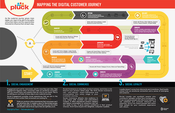
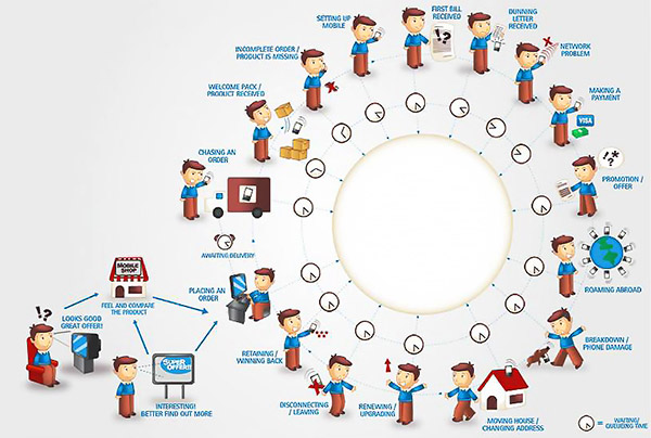
There’s a lovely graphic below of a UJ which would probably suit business stakeholders, but mostly won’t contain the level of architectural or systems detail a dev team may want. You will need to consider how you format your UJ for the best impact.

Defining the lens
According to Chris Risdon from Adaptive Path, “The lens is an overriding filter through which you view the journey”. The lens indicates some key findings or principles that you should keep in mind while working on the journey map. If you have 2 or 3 clearly distinct user personas and you are interested in a particular user behaviour flow, the lens will include some of the main characteristics of specific user personas.
Gathering data
The effectiveness of any UJ fundamentally depends on the quality of the insights it provides. Back up the UJ with solid research data and a variety of information sources. Maybe use your contact centre logs, customer satisfaction surveys, Google Analytic data or middleware analytics from products such as Qubit. All can give you really insightful…err…insight into what your customers are doing. There’s always an importance of quantative data (40% of people fail to fill in the application form for example) but I personally focus on the emotional aspect of the UJ taking learnings from what we do ourselves online.
Drafting a map
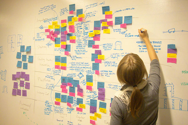
Getting everyone involved early on often helps the ‘design by committee’ perils which often impact projects like UJ creation later down the line. Get your UX Pros, Insight teams, Designers, Developers, heck, maybe even some customers and get them all in, feed them coffee & cake and get that UJ mapped out on paper, with the biggest pens you can find! That’ your starting point, your baseline. Sticky notes optional but always welcome!
You can then start summarising all the key findings into something more concise and presentable. Now is the time to start experimenting with data visualisation so take your time to design something that’s just right for your particular map. You just need to make sure it delivers valuable insight grounded in research and it be in an easy-to-use format.
How to use your UJ
One of the sad things I see is this work being left in the CEO’s drawer never to see light again. UJ analysis is so important and to summarise;
You can improve your existing UX by
- Identify pain points
- Identify opportunities for measurement
- Zero in on root cause of customer pain
Not only being able to drive organisational change, help map out corporate strategy and plan the deployment of anything you’re going to build in the future.
So why wouldn’t you do a UJ right?


